NEW POSTER: PANDORA'S CABIN (IN THE WOODS)

Due to certain circumstances, a gallery opening at Gallery 1988 in which was invited to contribute, was cancelled. This was a bit of a bummer, but closing one (cabin) door opened another! It was short notice, but Gallery 1988 invited me to do something for the Joss Whedon tribute show... opening in 2 weeks. Of course I was going to do it, but how?

Not a Buffy fan and only having seen a few episodes of Firefly (there goes my street cred), I immediately thought Avengers. Gallery 1988 said no Avengers art for this show. But then, I remembered Cabin in the Woods. 

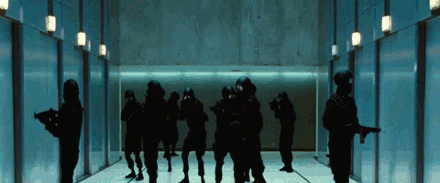
Specifically, this badass scene where all Hell breaks loose:

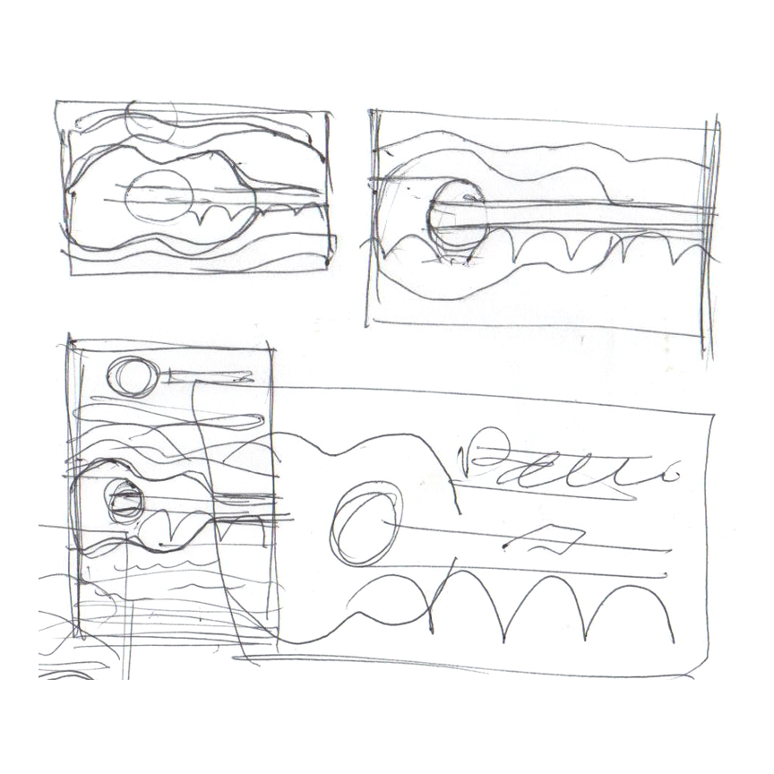
With no time to spare, I started sketching up some ideas. I wanted it to be pretty simple, not too spoiler-y, and a nod to retro horror posters. Here's the winning concept:

I thought of Pandora's Box, the Greek myth about a woman named Pandora who receives a container with all the world's evil inside. Her curiosity gets the best of her and she opens the container, releasing evil onto the world. With this as inspiration, I came up with a design in which the roof of the cabin is acting as the lid of a box. This lid is opened and all the beasts are pouring out the top. It doesn't say why or how, it just says what: someone just opened up a box of mayhem.

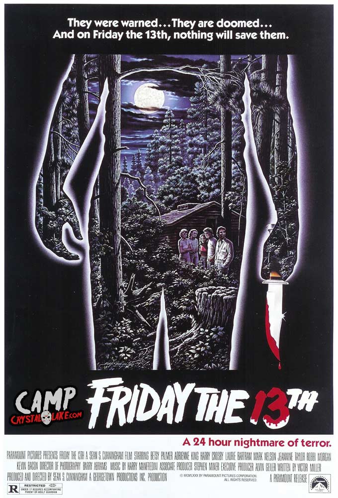
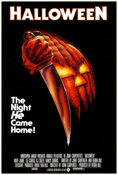
I wanted the style to be reminiscent to classic 70s-80s horror posters like the original Friday the 13th, Halloween, or even Alien; a main central image that represents setting and antagonist. I also liked the bold typography utilized.

friday-the-13th-part1-sm.jpg

The Cabin itself was the easy part (aside from having to pause Netflix a million times to make sure my cabin is accurate). I got a little carried away with the texture, so the version below was eventually simplified.

The monsters were the tough part. Which ones to use, how many of them, all of them, the obscure ones? These were questions I kept asking during the process.

Here are a few shots of the process. Notice a few of the sketched out monsters didn't make the final cut, like the Sugarplum Fairy, or the blob that was supposed to be the Merman. Also, I re-did the Wraith (ghost thing) so he didn't look so swollen.

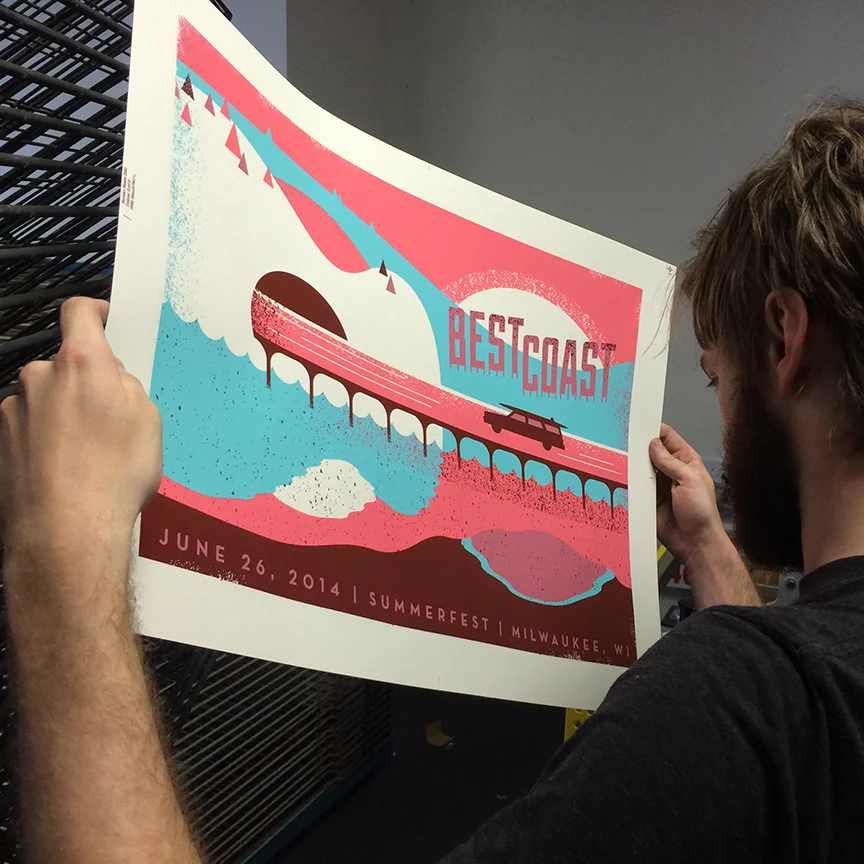
It took me a week, off and on, to complete those damn monsters. This was by far the most texture I've used in a piece. I had to eventually separate the poster's layers in Photoshop because Illustrator was moving so incredibly slow. So now that everything is done on my end, Mama's Sauce has only seven days to print and ship 50 screen printed posters from Florida to California. They were able to pull some strings, and some squeegees, and make it happen. They definitely said I got lucky on this one, just barely squeezing into their busy schedule. They really killed it on this poster (get it?)

Here is the final print drying on the Mama's Sauce racks.

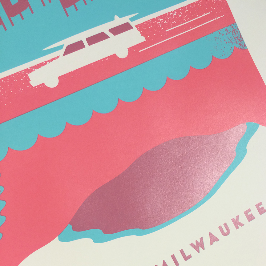
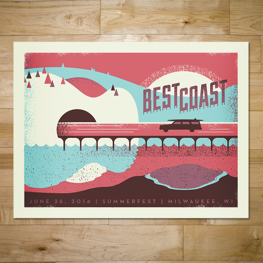
Here is the final design in all its gory glory!

hold.jpg

A very limited quantity is available in the Bandito Shop. Get 'em while they last!

Posted on September 14, 2014 .

JUST FOR FUN: X-MEN DAYS OF FUTURE PAST POSTER

X-Men Days of Future Past has been my favorite movie experience of 2014. Loved Godzilla, Winter Soldier, and Edge of Tomorrow, but DOFP came out on top.

The story has always been a fan favorite of comic readers, but with the X-franchise's track record (X3, X-Men Origins: Wolverine, The Wolverine) I was hesitant, but optimistic. I did like First Class a lot, and knowing the DOFP storyline, I was totally excited to see how they were going to integrate the old cast with the younger cast. They definitely pulled it off, told a great story with their own twist, and in my mind executed some of the best super-hero scenes to date.

My one and only critique was the official poster, seen below.

X-Men-Days-of-Future-Past-Poster-High-Res.jpg

Now, I understand there are contractual obligations the agency has to follow regarding the size of characters, which characters get top billing, and how they are represented, so I'm not blaming the designers who worked on this at all. I'm sure it was designed by a committee of studio execs saying "Halle Berry has to be in there, put the chick who throws portals in there (I thought it was Psylocke), make Ellen Page look super bored, and have Captain Picard farting fire. Oh and make sure there is at least one big blue boob in there." Where's the drama? Where's the action? It kind of looks like a photoshop tutorial gone wrong.

In the marketing team's defense, there were some other really nice images used for promotion, like these single character shots (even though I had serious doubts about Quicksilver's outfit).

xmen-mystique.jpg

These two alternate posters below are great too. I know they are much more clean, due to not as many characters being represented, but they definitely work better!

And these two posters were just brilliant. These seemed to show up early in the campaign and I really appreciated how clever and subtle they are. And it celebrates the franchise's perfect casting!

So after all that, I just sound like a nerdy poster snob who is probably very ignorant regarding the movie industry and the process of designing a poster for a huge summer blockbuster. Not to mention, I am critiquing the marketing team whose work went into grossing $712,676,000 worldwide (at the time of this post) making DOFP the highest grossing entry in the X-Men film series and currently the highest grossing comic-book film adaptation of the year, and is also currently the highest grossing film of 2014. What a jerk.


BUT, THIS IS HOW I WOULD HAVE DONE IT!

I wanted to give it a try! So I quickly sketched something out, keeping in mind that I needed to include as many of the characters as I could, since I'm sure that was a goal. I also wanted to at least keep Wolverine to be the largest presence, since that seemed to be a theme in most of the official marketing.

My solution was to make it two posters! Since this movie deals with a storyline that is occurring simultaneously in the past AND present, it made sense to have a poster for each. It's not a completely novel concept considering the official marketing for the movie included some images organized like this (split down the middle and stuff).

I picked some of my favorite moments from the movie, trying hard to remember how it all went down after returning from the theater.


CLEANED UP SKETCHES

I tried to section off portions of the poster, in the shape of an "X", as cleanly as possible. Each little panel was its own scene or plot point. I was pleased with how "comic-booky" it was feeling.


POSTER A: THE PAST


POSTER B: THE FUTURE


PUT 'EM TOGETHER

I think they work as individual posters pretty well, but the side-by-side setup provides the most impact. Each poster is a 3-color print. I wanted both posters to have different color schemes, but not feel too distant from each other, so they share the darkest blue to help them feel more connected. The monochromatic palettes were chosen to unify and almost flatten each design, since the design itself was pretty busy.

Wolverine is in the middle, since he is the link between the past and present (spoilers?) and past and future versions of Magneto and Xavier are both represented in each poster. I wanted some of the action in each poster to feel parallel, just like it does in the movie.


BUT WAIT...

I know my solution of two posters is kind of cheating, but it was too convenient to not try and give it a shot. Below is a single poster design, incorporating both time periods into one poster. Wolverine is depicted in a third color scheme to show that he exists outside of time, or in both times at once, or something like that. Again, I wanted it to pay homage to comics with color choices and overall composition.

So there it is! I'm not saying it's the absolute best solution in the world, but it sure was fun to work out. I can't wait for the next X-Men movie, maybe FOX will explore an illustrated campaign. Who knows?!

Check out more awesome illustrated DOFP fan posters here!

NEW WORK: BEST COAST GIG POSTER

I was excited to have the opportunity to create a gig poster for Best Coast's Summerfest gig, happening in Milwaukee this June. It had been a while since I had done any gig-posterin', so I wanted to make sure it was done right! Whatever that means.

So I listened to the new Best Coast album, Fade Away, and noticed a frequent mention of sunsets, the sun, etc. Further inspiring me was the fact that the album had an overall fun travel music vibe. Like a great album for a road trip or a vacation. I also wanted to incorporate the imagery of music somehow.


SKETCHIN'

My first step to making a poster: sketch it out. My sketches are usually fast, dirty, and apparently done with my feet. These hilariously bad sketches show how its not about making a pretty sketch, it's just thinking on paper.

The idea was to have an old-school station wagon driving on a bridge, in a hilly landscape, during sunset. How those scribbles led me to those conclusions is a mystery to even me. After sketchin' it out, I was able to get the bridge and tunnel to subtly resemble a guitar. I don't usually like horizontal gig posters, but I couldn't get this concept to work any other way.


COLOR OPTIONS

I wanted to have some contrasty colors, with sort of a dreamy psychedelic vibe. Below are some color explorations. The design was still evolving, and I saw that it might benefit from using a transparent color to add more depth and interest. Getting a semi-realistic water ripple in the reflection was a pain, but it added something more as well.

Here is the final design, with the final colors, separated into layers to show you how it all went down. Notice how the pink layer of ink is transparent, and mixes with the blue layer to technically create a fourth color.

FILE PREP

Lately, I have really been trying to clean my files up and optimize them for print the best I can. I know registration can't be perfect, and Mama's Sauce does a great job, but I wanted to account for any slight misregistration. To do this, I proceeded to add trapping to my layers. I made sure that there were overlapping colors wherever layers met up. This way, if anything shifted, there would not be any unsightly gaps where the paper is showing through. See the animation below for a quick example.

COLOR TESTING

Adding a transparent color is more interesting, but it adds complexity to the project. Luckily, the fine pressmen and presswomen at Mama's Sauce are very accommodating! I selected a French Paper and three colors I thought would work. The Mama's Sauce ink magicians made some suggestions and even went above and beyond by testing each ink, on the specified paper, and sending me a picture. It was perfect and the poster was ready to go on press!

After the first blue layer of ink was down and dry, it was time for the transparent pink. This is always a little scary, since there really is no way to accurately guess what that overlapping color will look like until it's on press. Mama's Sauce pulled through yet again with another picture of the poster on press. That purple overprint was great and my transparent color anxiety was relieved!

THE FINAL PRODUCT

Here is the completed gig poster, ready to be sent off to Summerfest. It was a fun ride (get it?) and I could not have done it without the consultation, expertise, and wonderful customer service of Mama's Sauce.