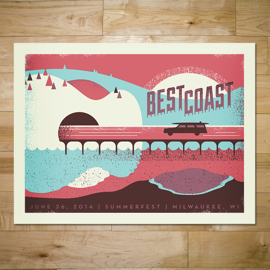
I was excited to have the opportunity to create a gig poster for Best Coast's Summerfest gig, happening in Milwaukee this June. It had been a while since I had done any gig-posterin', so I wanted to make sure it was done right! Whatever that means.
So I listened to the new Best Coast album, Fade Away, and noticed a frequent mention of sunsets, the sun, etc. Further inspiring me was the fact that the album had an overall fun travel music vibe. Like a great album for a road trip or a vacation. I also wanted to incorporate the imagery of music somehow.
SKETCHIN'
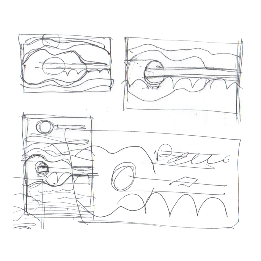
My first step to making a poster: sketch it out. My sketches are usually fast, dirty, and apparently done with my feet. These hilariously bad sketches show how its not about making a pretty sketch, it's just thinking on paper.
The idea was to have an old-school station wagon driving on a bridge, in a hilly landscape, during sunset. How those scribbles led me to those conclusions is a mystery to even me. After sketchin' it out, I was able to get the bridge and tunnel to subtly resemble a guitar. I don't usually like horizontal gig posters, but I couldn't get this concept to work any other way.
COLOR OPTIONS
I wanted to have some contrasty colors, with sort of a dreamy psychedelic vibe. Below are some color explorations. The design was still evolving, and I saw that it might benefit from using a transparent color to add more depth and interest. Getting a semi-realistic water ripple in the reflection was a pain, but it added something more as well.
Here is the final design, with the final colors, separated into layers to show you how it all went down. Notice how the pink layer of ink is transparent, and mixes with the blue layer to technically create a fourth color.
FILE PREP
Lately, I have really been trying to clean my files up and optimize them for print the best I can. I know registration can't be perfect, and Mama's Sauce does a great job, but I wanted to account for any slight misregistration. To do this, I proceeded to add trapping to my layers. I made sure that there were overlapping colors wherever layers met up. This way, if anything shifted, there would not be any unsightly gaps where the paper is showing through. See the animation below for a quick example.
COLOR TESTING
Adding a transparent color is more interesting, but it adds complexity to the project. Luckily, the fine pressmen and presswomen at Mama's Sauce are very accommodating! I selected a French Paper and three colors I thought would work. The Mama's Sauce ink magicians made some suggestions and even went above and beyond by testing each ink, on the specified paper, and sending me a picture. It was perfect and the poster was ready to go on press!
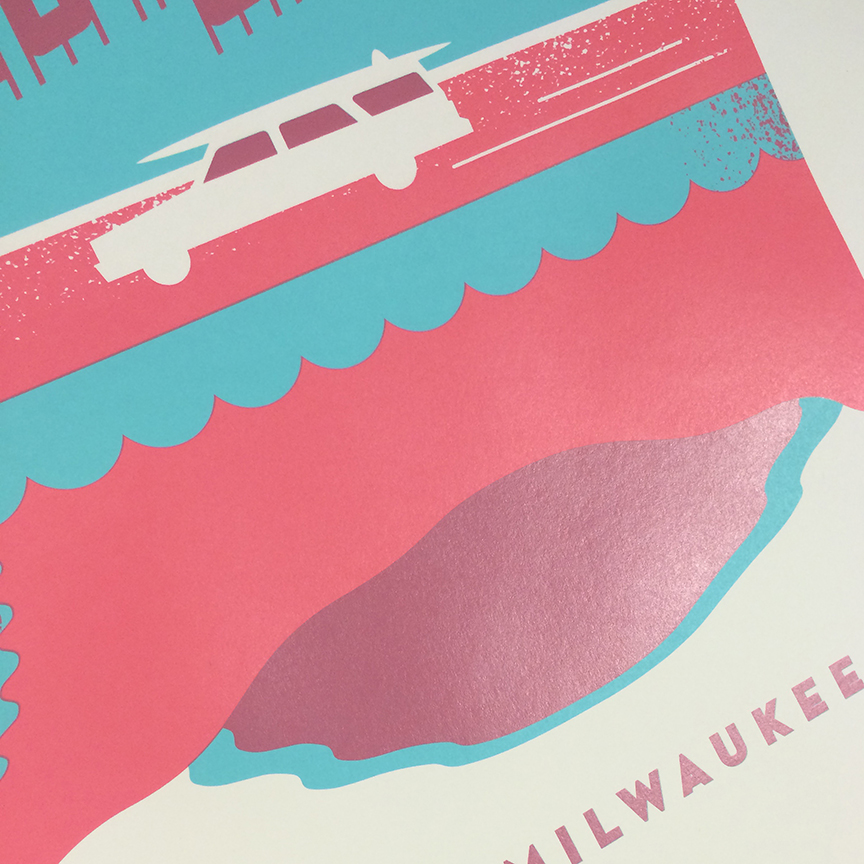
After the first blue layer of ink was down and dry, it was time for the transparent pink. This is always a little scary, since there really is no way to accurately guess what that overlapping color will look like until it's on press. Mama's Sauce pulled through yet again with another picture of the poster on press. That purple overprint was great and my transparent color anxiety was relieved!
THE FINAL PRODUCT
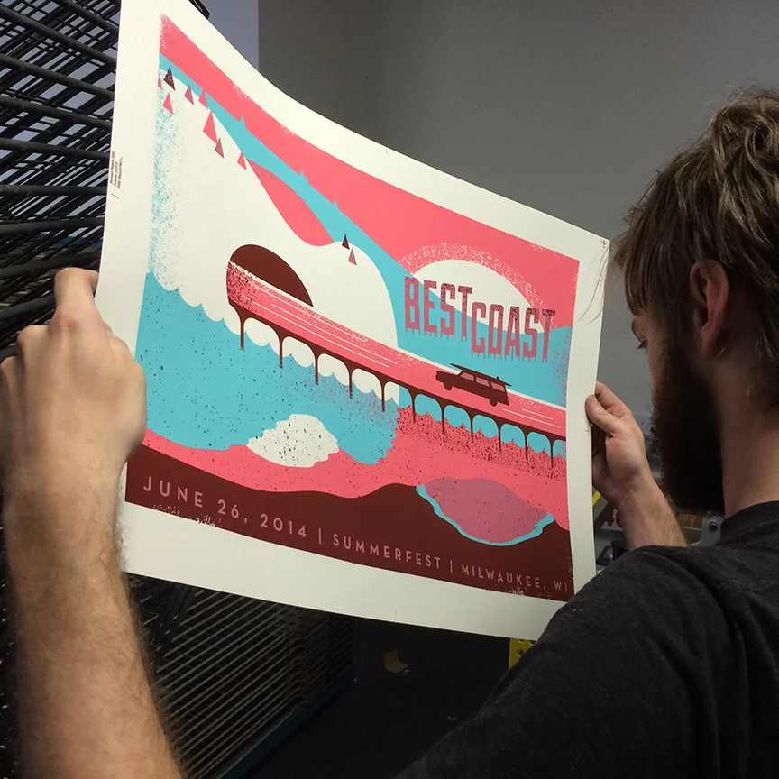
Here is the completed gig poster, ready to be sent off to Summerfest. It was a fun ride (get it?) and I could not have done it without the consultation, expertise, and wonderful customer service of Mama's Sauce.
