


NEW WORK: FOOD A'FAIRE
The Grand Rapids Downtown Market has quite an impressive food education program. It was created to offer culinary and nutrition education, entrepreneur opportunities, a place for local food production and greenhouse growing, all centered around the goal of creating a healthy community lifestyle. They do this seven days a week, 365 days a year. And, with the ability to offer scholarships, they do it for everyone.
To continue offering such a robust program, the Market decided to involve the community by throwing a fundraiser. It was a wild night of great food, crazy entertainment, and a lot of generosity. It was incredible to see so many people support the program through donations, bidding on auction items, selling tickets for the event, and being overall champions of the Market, food education, and the community of Grand Rapids.
That being said, I got to brand everything!
LOGO

Naturally, food played a big part in the branding and event planning. The visuals, however, were inspired by vintage French circus elements.
VARIATIONS AND ICONS
PRINTED MATERIALS

There were a few moving parts involved in this project, and all had to look consistent and fun. Through a combination of in-house printing and a few offset pieces, it all came together as a cohesive set! French Paper's Midnight Blue and Fuse Green served as color inspiration, and was even used as the sponsorship booklet cover and belly band! Other items included: Promotional coasters, drink tickets, event tickets, invitation mailer, event program, and thank you gift!
EVENT WEBSITE
The event website needed to explain the cause we were raising funds for, describe the agenda for the night, link to our generous sponsors, show all silent auction items, and of course, sell tickets! I kept it pretty simple so we could highlight the sponsors and a few infographics to illustrate the issue.

EVENT PHOTOGRAPHY
The entertainment included monkey butlers, accordion players, confetti canons, wine bikes, strolling table ladies, and swan processions! There were over 30 different types of small bites created by the education department's in-house instructor/chef such as crab cups, fried polenta, mini crepe bowls with duck Duck à l'orange, bruschetta, macaroons, lemon curd tarts, and many more.
NEW POSTER: PANDORA'S CABIN (IN THE WOODS)
Due to certain circumstances, a gallery opening at Gallery 1988 in which was invited to contribute, was cancelled. This was a bit of a bummer, but closing one (cabin) door opened another! It was short notice, but Gallery 1988 invited me to do something for the Joss Whedon tribute show... opening in 2 weeks. Of course I was going to do it, but how?
Not a Buffy fan and only having seen a few episodes of Firefly (there goes my street cred), I immediately thought Avengers. Gallery 1988 said no Avengers art for this show. But then, I remembered Cabin in the Woods.
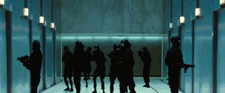
Specifically, this badass scene where all Hell breaks loose:
With no time to spare, I started sketching up some ideas. I wanted it to be pretty simple, not too spoiler-y, and a nod to retro horror posters. Here's the winning concept:

I thought of Pandora's Box, the Greek myth about a woman named Pandora who receives a container with all the world's evil inside. Her curiosity gets the best of her and she opens the container, releasing evil onto the world. With this as inspiration, I came up with a design in which the roof of the cabin is acting as the lid of a box. This lid is opened and all the beasts are pouring out the top. It doesn't say why or how, it just says what: someone just opened up a box of mayhem.
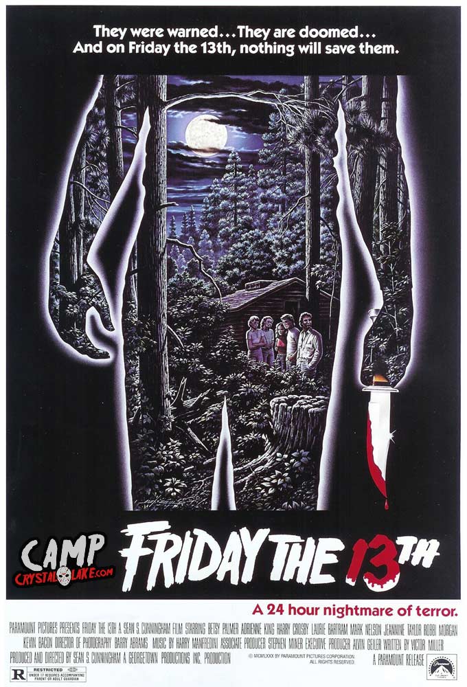
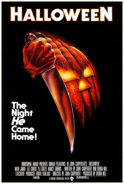
I wanted the style to be reminiscent to classic 70s-80s horror posters like the original Friday the 13th, Halloween, or even Alien; a main central image that represents setting and antagonist. I also liked the bold typography utilized.

The Cabin itself was the easy part (aside from having to pause Netflix a million times to make sure my cabin is accurate). I got a little carried away with the texture, so the version below was eventually simplified.

The monsters were the tough part. Which ones to use, how many of them, all of them, the obscure ones? These were questions I kept asking during the process.
Here are a few shots of the process. Notice a few of the sketched out monsters didn't make the final cut, like the Sugarplum Fairy, or the blob that was supposed to be the Merman. Also, I re-did the Wraith (ghost thing) so he didn't look so swollen.


It took me a week, off and on, to complete those damn monsters. This was by far the most texture I've used in a piece. I had to eventually separate the poster's layers in Photoshop because Illustrator was moving so incredibly slow. So now that everything is done on my end, Mama's Sauce has only seven days to print and ship 50 screen printed posters from Florida to California. They were able to pull some strings, and some squeegees, and make it happen. They definitely said I got lucky on this one, just barely squeezing into their busy schedule. They really killed it on this poster (get it?)
Here is the final print drying on the Mama's Sauce racks.

Here is the final design in all its gory glory!

A very limited quantity is available in the Bandito Shop. Get 'em while they last!