Posts filed under new work

NEW POSTER: ALIENS

CRAZY 4 CULT: BACK IN LA

Gallery1988's most anticipated annual art show, Crazy 4 Cult, is back in LA this year for it's 8th installment. I've had the pleasure of contributing to the last two shows, both in New York. It's their biggest show each year, and it's awesome to be in the lineup as a regular!

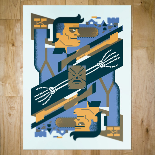
PAST C4C CONTRIBUTIONS

Army of Darkness and Clerks. Both way up there on my list of favs. For this year, I wanted to continue to design a poster that incorporated the movie in a clever way (like Ash on a playing card and Jay an Silent Bob reenacting American Gothic). 

I decided to do something a little different and create a poster that could be used inside the universe of the movie. Aliens is a perfect Scifi Action movie (with some horror elements) that I have always been a huge fan of. For this kind of cheeky, meta poster, Aliens was perfect with all it's catch phrases, cool weapons, xenomorphs, and mostly because the Colonial Marines are just ultimate badasses!
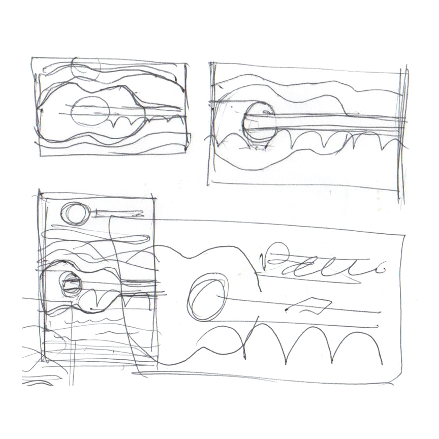
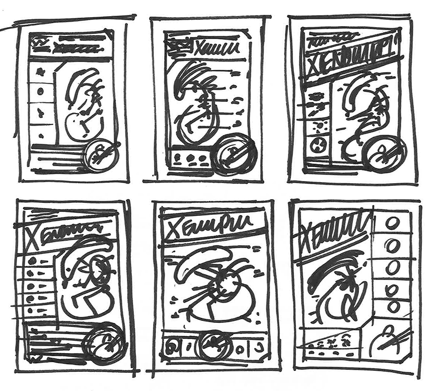
 

SKETCHES

As usual, the design process started with loose sketches. I wanted the design to fit in with the 80s vision of the future, so that meant 45 degree angles! Notched out corners on everything! The content I decided to include consisted of weapons, xeno life-cycle, and xeno physiology. This poster is intended to resemble something that Weyland-Yutani would pass out to the Colonial Marines as preparation for their mission. After all, it was a little more to handle than your average bug hunt.


RESEARCH

A lot went into making sure the details were as accurate as possible. The guns had to be exact, the xeno had to be anatomically correct, and the language had to be on point. So I pulled images from xenopedia (yes that's a real thing) and I watched the movie like 8 times. Seriously, the art direction and practical effects make this movie incredible. Lots of inspiration to pull from.


DESIGN

Here are a few shots of the process. I went from sketches to wireframes, then I just started filling in the shapes one by one. I experimented with different color combos, but the original was the best—gotta love that slimy green!
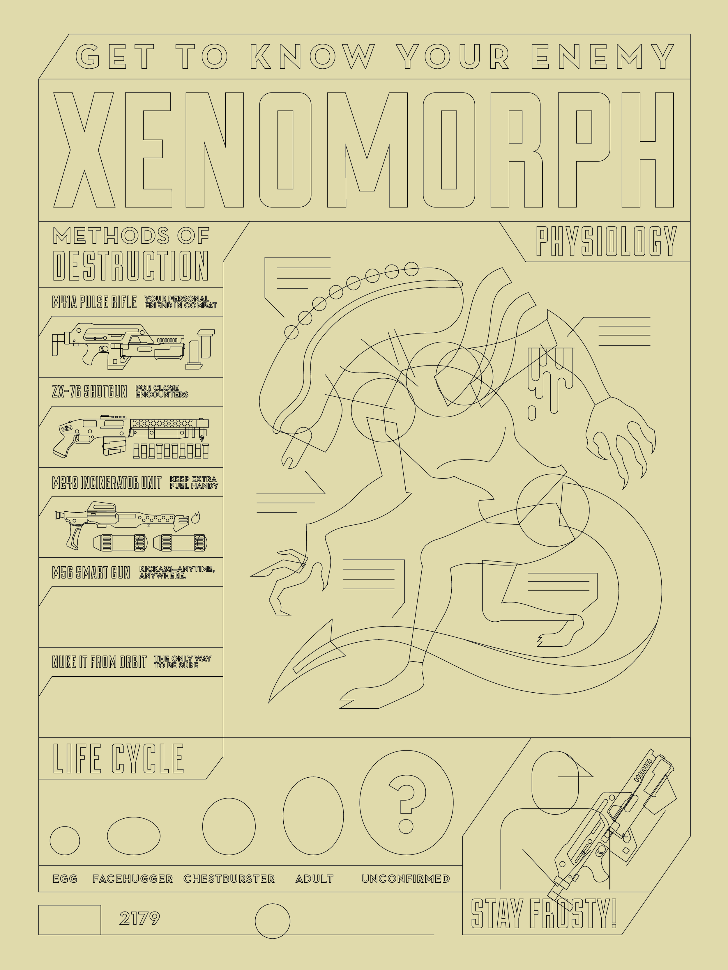
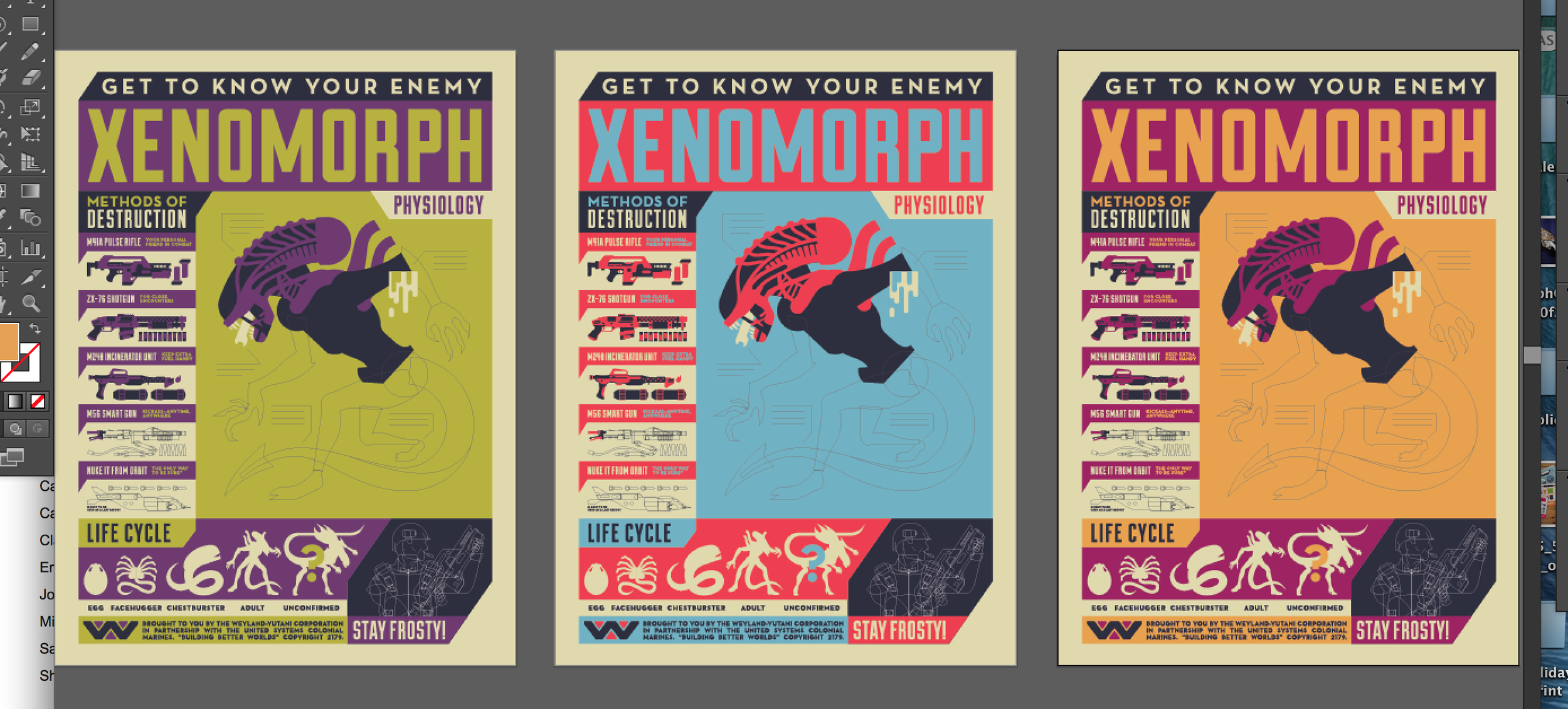
process_1.png


THE FINAL DESIGN

The process was a labor of love. Those damn guns took forever to make, and even longer to prep for print. Totally worth it, though. The final design was full of fun movie references and garish color and cool-ass aliens. This is definitely an example of me designing something that I would personally hang up. Click on the final design to see it bigger.

The movie is non-stop iconic quotes, sweet futuristic technology, killer weapons, and creepy alien fun! I wanted to make sure my design captured that.
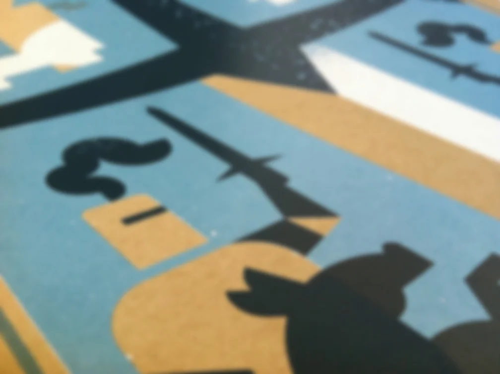
 

PRINTING

Once again, Mama's Sauce destroyed the printing process for this one. Game over man, game over. Check out the detail shots below.


THE PRINTED PIECE

I have very limited quantities of these. The ones in the shop are my Artist Proofs, so get them while you can!

Posted on December 19, 2014 and filed under new work.

NEW WORK: BEST COAST GIG POSTER

I was excited to have the opportunity to create a gig poster for Best Coast's Summerfest gig, happening in Milwaukee this June. It had been a while since I had done any gig-posterin', so I wanted to make sure it was done right! Whatever that means.

So I listened to the new Best Coast album, Fade Away, and noticed a frequent mention of sunsets, the sun, etc. Further inspiring me was the fact that the album had an overall fun travel music vibe. Like a great album for a road trip or a vacation. I also wanted to incorporate the imagery of music somehow.


SKETCHIN'

My first step to making a poster: sketch it out. My sketches are usually fast, dirty, and apparently done with my feet. These hilariously bad sketches show how its not about making a pretty sketch, it's just thinking on paper.

The idea was to have an old-school station wagon driving on a bridge, in a hilly landscape, during sunset. How those scribbles led me to those conclusions is a mystery to even me. After sketchin' it out, I was able to get the bridge and tunnel to subtly resemble a guitar. I don't usually like horizontal gig posters, but I couldn't get this concept to work any other way.


COLOR OPTIONS

I wanted to have some contrasty colors, with sort of a dreamy psychedelic vibe. Below are some color explorations. The design was still evolving, and I saw that it might benefit from using a transparent color to add more depth and interest. Getting a semi-realistic water ripple in the reflection was a pain, but it added something more as well.

Here is the final design, with the final colors, separated into layers to show you how it all went down. Notice how the pink layer of ink is transparent, and mixes with the blue layer to technically create a fourth color.

FILE PREP

Lately, I have really been trying to clean my files up and optimize them for print the best I can. I know registration can't be perfect, and Mama's Sauce does a great job, but I wanted to account for any slight misregistration. To do this, I proceeded to add trapping to my layers. I made sure that there were overlapping colors wherever layers met up. This way, if anything shifted, there would not be any unsightly gaps where the paper is showing through. See the animation below for a quick example.

COLOR TESTING

Adding a transparent color is more interesting, but it adds complexity to the project. Luckily, the fine pressmen and presswomen at Mama's Sauce are very accommodating! I selected a French Paper and three colors I thought would work. The Mama's Sauce ink magicians made some suggestions and even went above and beyond by testing each ink, on the specified paper, and sending me a picture. It was perfect and the poster was ready to go on press!

After the first blue layer of ink was down and dry, it was time for the transparent pink. This is always a little scary, since there really is no way to accurately guess what that overlapping color will look like until it's on press. Mama's Sauce pulled through yet again with another picture of the poster on press. That purple overprint was great and my transparent color anxiety was relieved!

THE FINAL PRODUCT

Here is the completed gig poster, ready to be sent off to Summerfest. It was a fun ride (get it?) and I could not have done it without the consultation, expertise, and wonderful customer service of Mama's Sauce.

NEW WORK: "THAT INKING FEELING" ARTIST SERIES

The dudes at Mama's Sauce had the bright idea to whip up some limited edition artprints to sling at Creative South this year. I was lucky enough to be included in this three-part artist series along with the magnanimous Dave Quiggle and the stupendous Clark Orr!

My contribution is a pirate ship being attacked by a giant squid. I had so much fun developing all these little characters. I think the diver is my favorite. 

My contribution is a pirate ship being attacked by a giant squid. I had so much fun developing all these little characters. I think the diver is my favorite. 

DETAIL SHOTS

Posted on April 16, 2014 and filed under new work.