X-Men Days of Future Past has been my favorite movie experience of 2014. Loved Godzilla, Winter Soldier, and Edge of Tomorrow, but DOFP came out on top.
The story has always been a fan favorite of comic readers, but with the X-franchise's track record (X3, X-Men Origins: Wolverine, The Wolverine) I was hesitant, but optimistic. I did like First Class a lot, and knowing the DOFP storyline, I was totally excited to see how they were going to integrate the old cast with the younger cast. They definitely pulled it off, told a great story with their own twist, and in my mind executed some of the best super-hero scenes to date.
My one and only critique was the official poster, seen below.
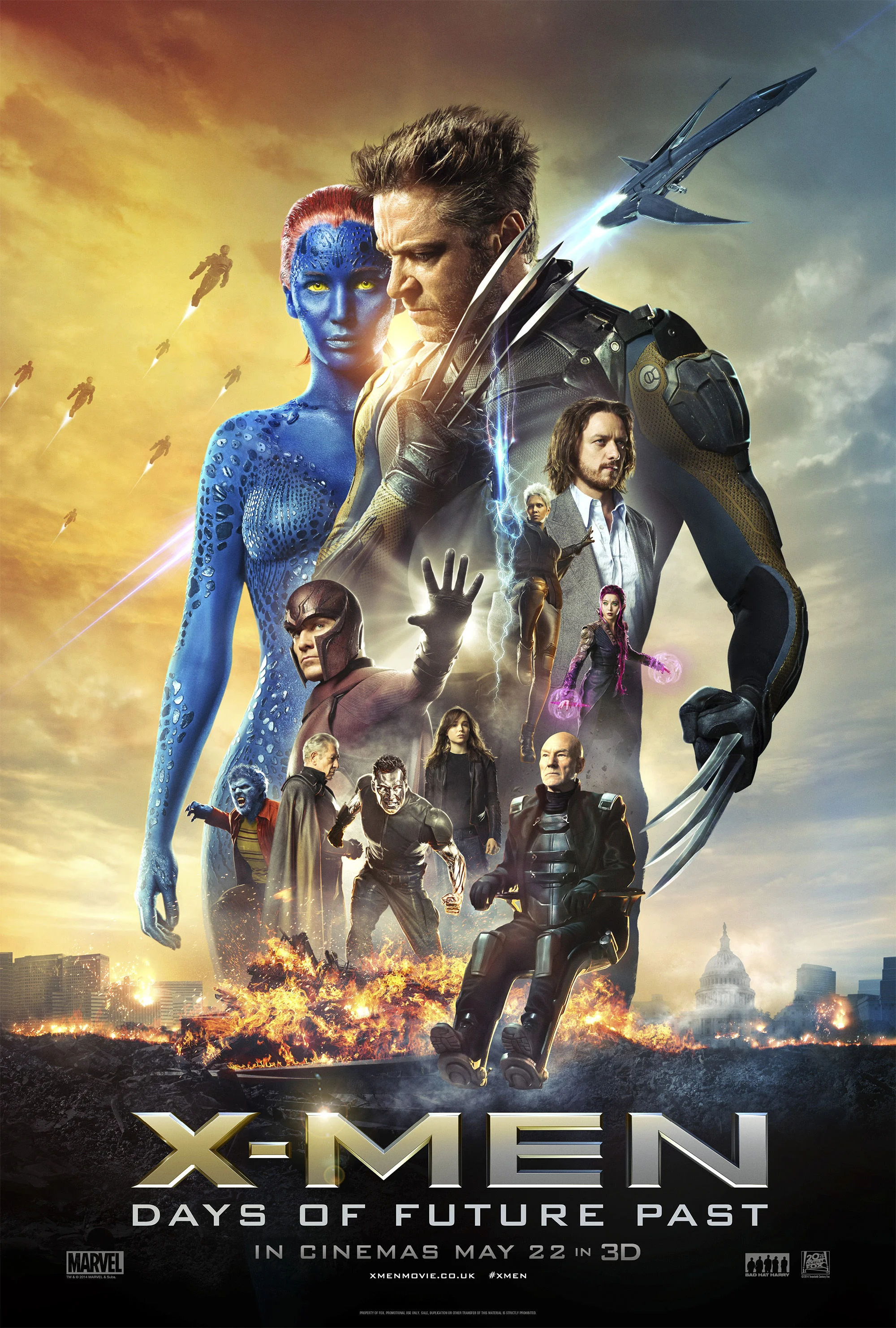
Now, I understand there are contractual obligations the agency has to follow regarding the size of characters, which characters get top billing, and how they are represented, so I'm not blaming the designers who worked on this at all. I'm sure it was designed by a committee of studio execs saying "Halle Berry has to be in there, put the chick who throws portals in there (I thought it was Psylocke), make Ellen Page look super bored, and have Captain Picard farting fire. Oh and make sure there is at least one big blue boob in there." Where's the drama? Where's the action? It kind of looks like a photoshop tutorial gone wrong.
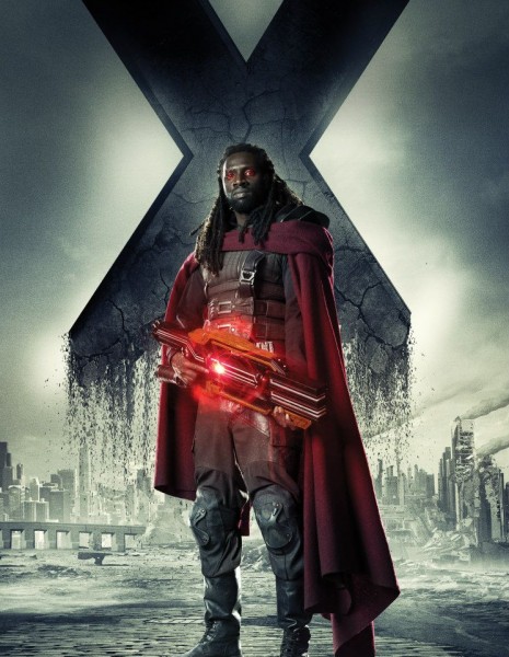
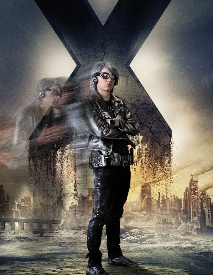
In the marketing team's defense, there were some other really nice images used for promotion, like these single character shots (even though I had serious doubts about Quicksilver's outfit).

These two alternate posters below are great too. I know they are much more clean, due to not as many characters being represented, but they definitely work better!

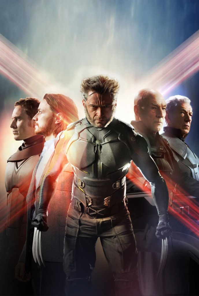
And these two posters were just brilliant. These seemed to show up early in the campaign and I really appreciated how clever and subtle they are. And it celebrates the franchise's perfect casting!


So after all that, I just sound like a nerdy poster snob who is probably very ignorant regarding the movie industry and the process of designing a poster for a huge summer blockbuster. Not to mention, I am critiquing the marketing team whose work went into grossing $712,676,000 worldwide (at the time of this post) making DOFP the highest grossing entry in the X-Men film series and currently the highest grossing comic-book film adaptation of the year, and is also currently the highest grossing film of 2014. What a jerk.
BUT, THIS IS HOW I WOULD HAVE DONE IT!
I wanted to give it a try! So I quickly sketched something out, keeping in mind that I needed to include as many of the characters as I could, since I'm sure that was a goal. I also wanted to at least keep Wolverine to be the largest presence, since that seemed to be a theme in most of the official marketing.
My solution was to make it two posters! Since this movie deals with a storyline that is occurring simultaneously in the past AND present, it made sense to have a poster for each. It's not a completely novel concept considering the official marketing for the movie included some images organized like this (split down the middle and stuff).
I picked some of my favorite moments from the movie, trying hard to remember how it all went down after returning from the theater.
CLEANED UP SKETCHES
I tried to section off portions of the poster, in the shape of an "X", as cleanly as possible. Each little panel was its own scene or plot point. I was pleased with how "comic-booky" it was feeling.
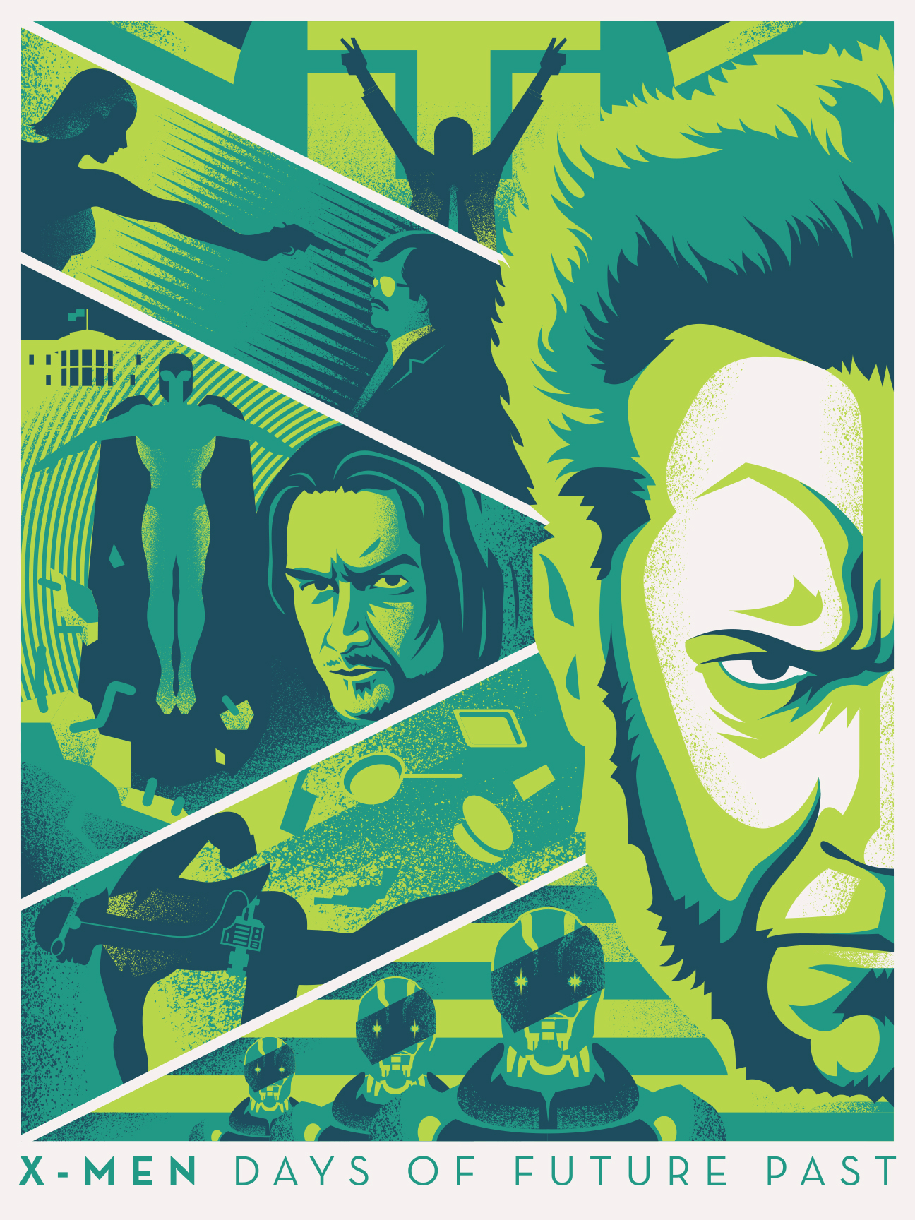
POSTER A: THE PAST
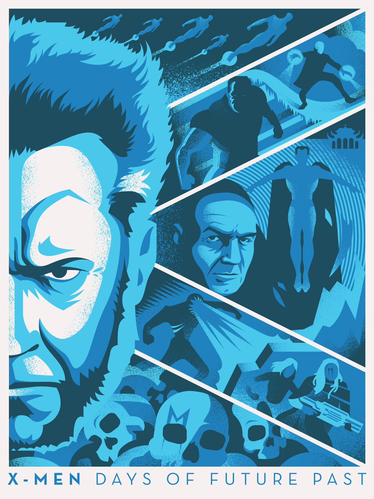
POSTER B: THE FUTURE
PUT 'EM TOGETHER
I think they work as individual posters pretty well, but the side-by-side setup provides the most impact. Each poster is a 3-color print. I wanted both posters to have different color schemes, but not feel too distant from each other, so they share the darkest blue to help them feel more connected. The monochromatic palettes were chosen to unify and almost flatten each design, since the design itself was pretty busy.
Wolverine is in the middle, since he is the link between the past and present (spoilers?) and past and future versions of Magneto and Xavier are both represented in each poster. I wanted some of the action in each poster to feel parallel, just like it does in the movie.
BUT WAIT...
I know my solution of two posters is kind of cheating, but it was too convenient to not try and give it a shot. Below is a single poster design, incorporating both time periods into one poster. Wolverine is depicted in a third color scheme to show that he exists outside of time, or in both times at once, or something like that. Again, I wanted it to pay homage to comics with color choices and overall composition.
So there it is! I'm not saying it's the absolute best solution in the world, but it sure was fun to work out. I can't wait for the next X-Men movie, maybe FOX will explore an illustrated campaign. Who knows?!
Check out more awesome illustrated DOFP fan posters here!